Simplii Learn
TEAM
Christopher Sung, Kirsten Mercado, Muhan Huang, Reina Kim, Vito Fan
ROLES
Interface Design, Experience Design, Interaction Design, User Research, Visual Design, Video Editor
To find a client with an experience design problem and propose a design intervention that provides value to the client from both a business and design perspective within 7 weeks.
Simplii Financial is a Canadian bank that currently allows newcomers to set up banking accounts with them before arriving to Canada. We believe Simplii Financial can find value in new ways to attract prospective clients through providing financial literacy services.
CONTEXT
Simplii Financial Problem Space
According to Statista's 2023 research, Canada welcomes approximately 500,000 new immigrants annually. Among the myriad challenges faced by immigrants, a prominent concern revolves around navigating Canada's financial landscape. Based on research conducted by Scotiabank in 2022, immigrants often feel overwhelmed, worried and confused when trying to understand the landscape exposing them to various of risks financially.
RESEARCH
How might Simplii Financial create a compelling experience for the working group of immigrants to help them to build financial confidence and security in Canada?
FRAMING QUESTION
Simplii Learn Demo
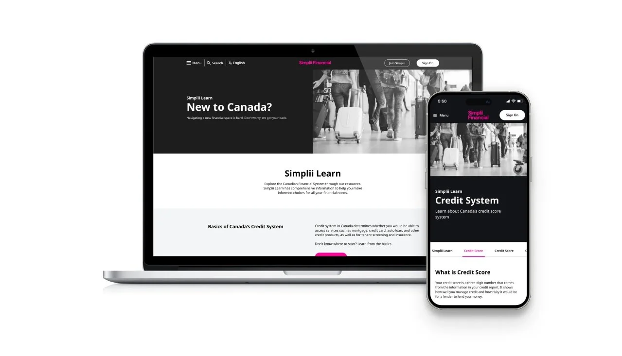
Simplii Learn is a new addition to the Simplii Financial website that allows newcomers to learn about the Canadian financial system in a digestible manner.
For our final prototype, we only covered the Canadian credit system due to time restrictions, but we would apply the same techniques to create addition pages regarding other sectors within the Canadian financial system.
SOLUTION
Through user testing, we found that most newcomers possess general knowledge of the credit system. To satisfy the needs of all newcomers, we included both general knowledge but also more in-depth questions newcomers may possess.
HIGH-LEVEL CONTENT
INTERACTIVE LEARNING
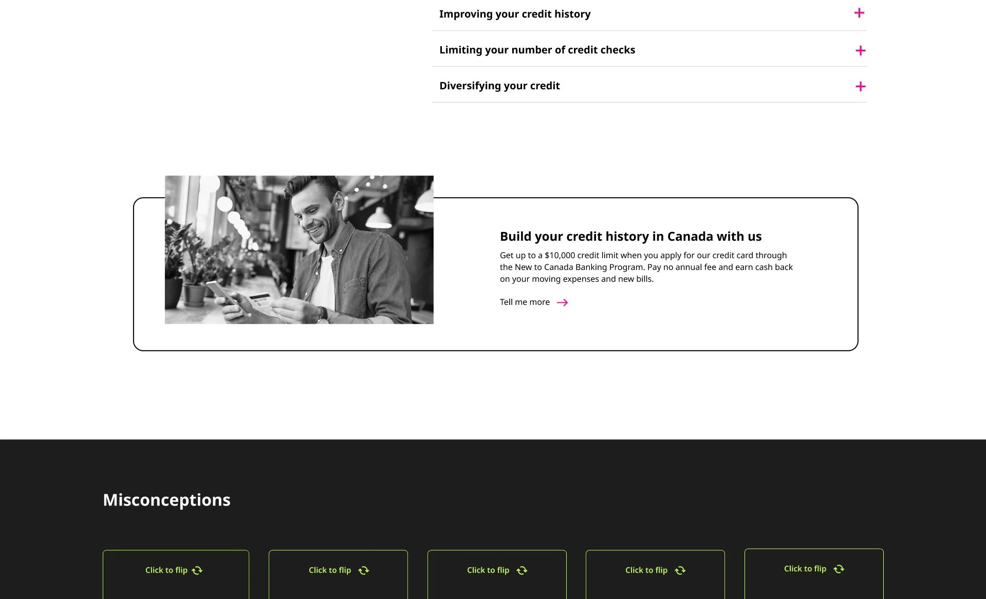
To help newcomers retain information they gain from using Simplii Learn, we decided to different interactive elements to make the learning process more engaging.
NEWCOMER STORIES
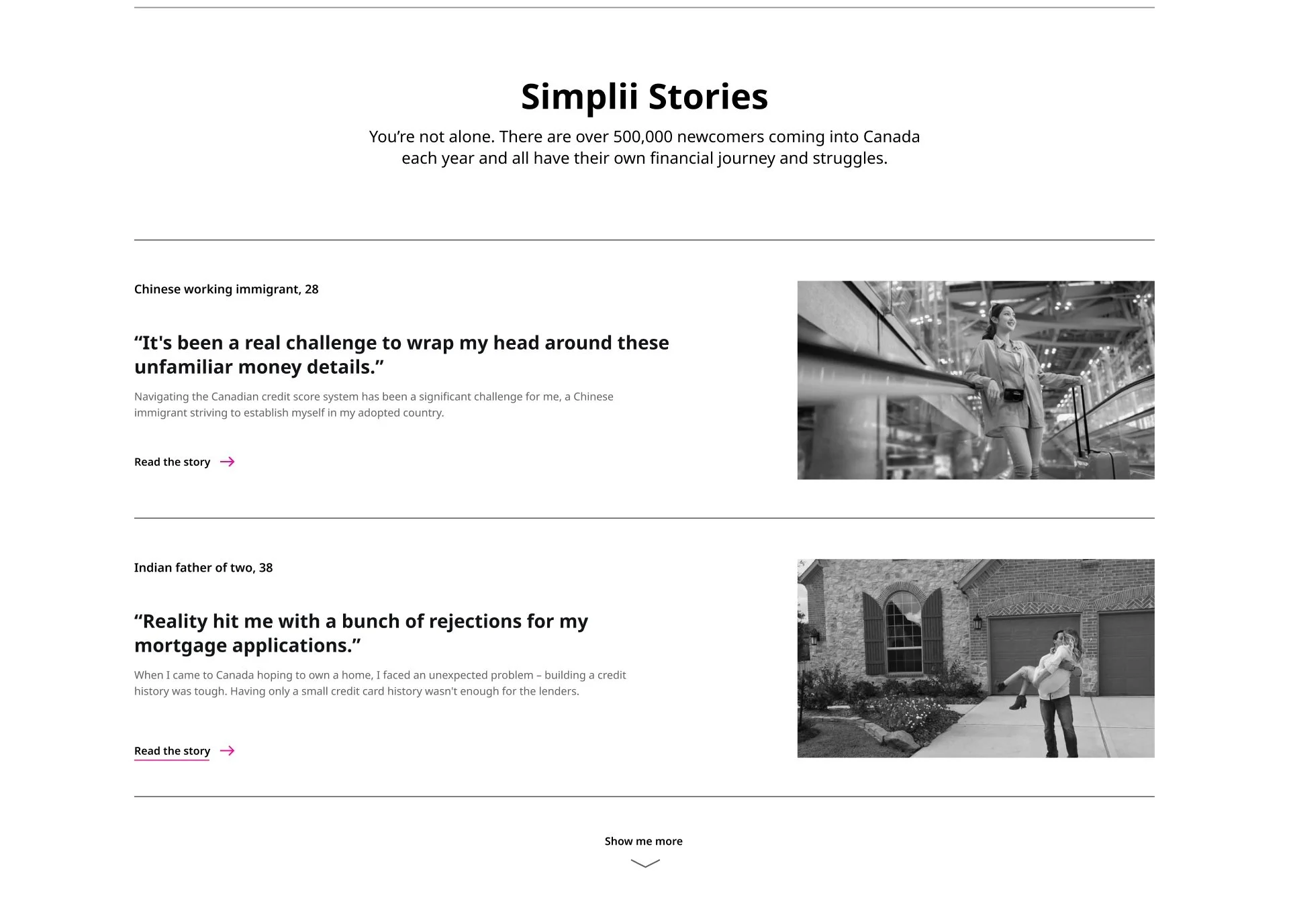
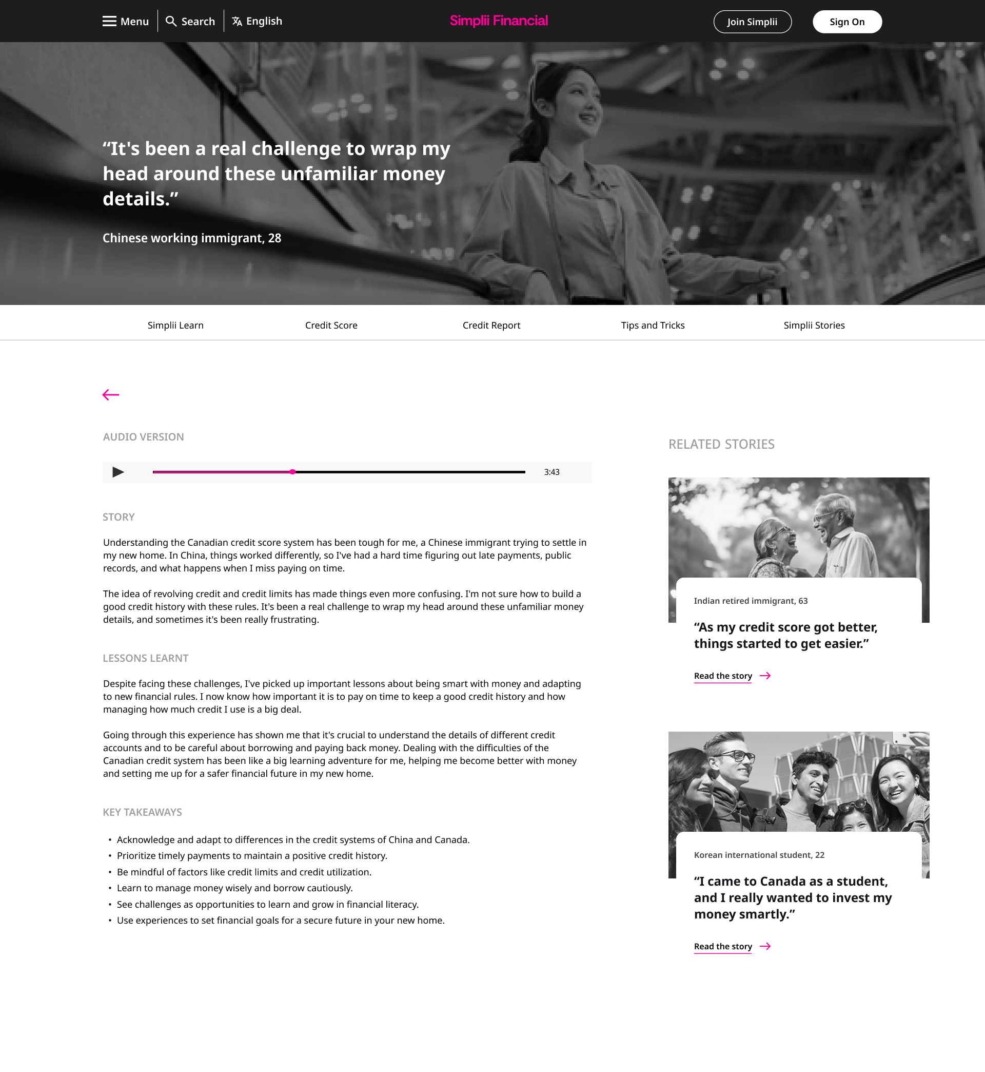
We wanted to create a sense of relatability and empathy by forming connections through sharing newcomer stories and their financial journeys. These stories range from success to failures, allowing newcomers to draw insights.
CALL TO ACTION
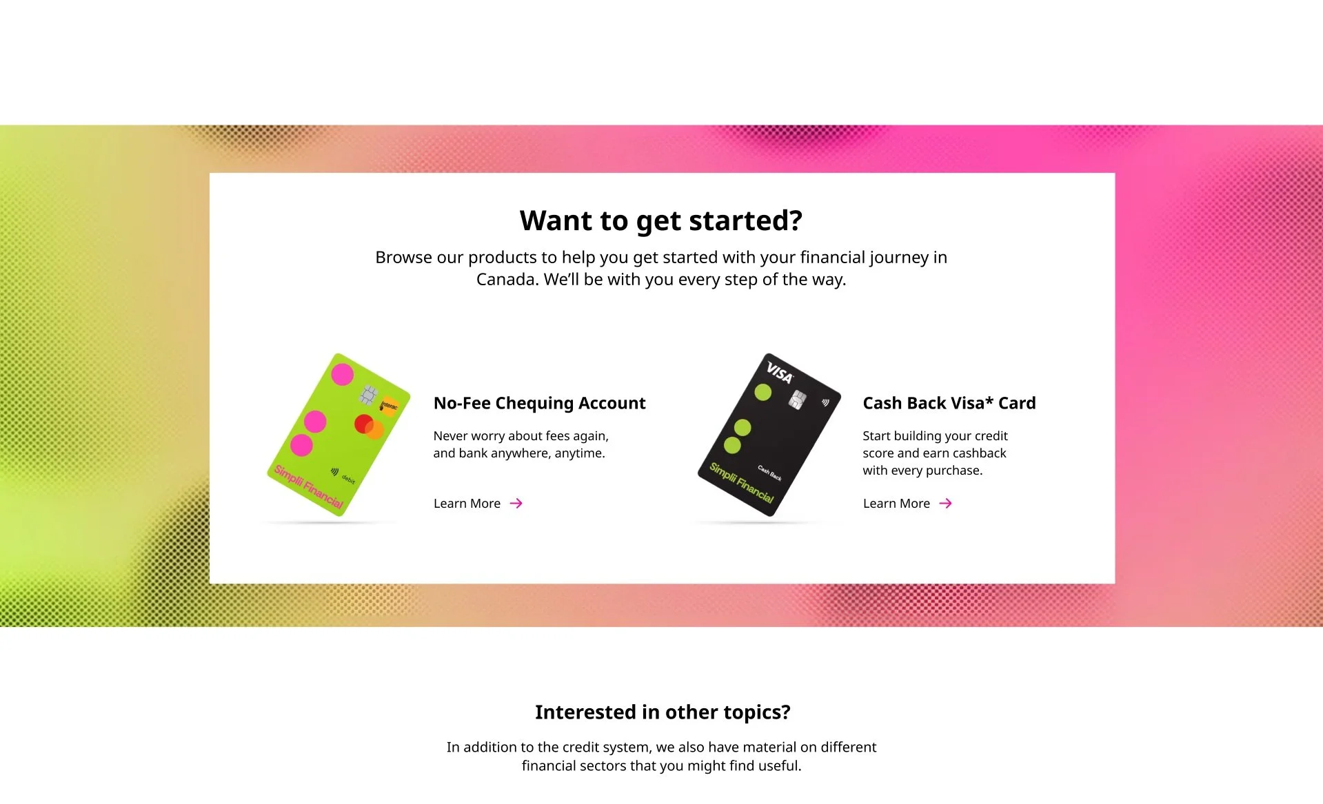
Introductions to Simplii Financial’s current offerings for newcomers have been placed throughout the page to assist an easy start to banking with Simplii Financial.
As we are targeting newcomers to Canada, many of them may not be proficient in English. To make learning accessible to all newcomers, we also added a new languages into Simplii Learn.
LANGUAGE
Our research suggested that immigrants use social media to find information, so we saw that as an entry point. Thus we wanted to give newcomers the option to use Simplii Learn on mobile as well.
MOBILE
To Business:
By educating newcomers about the Canadian financial system, Simplii Financial can demonstrate expertise and building trust with customers. Additionally, it serves as a compelling tool to attract new customers, encouraging them to create an account and initiate their credit journey with Simplii Financial.
To Customers:
Newcomers get to learn about the Canadian financial system, allowing them to make better informed financial decisions. It also offers a seamless entry point to select Simplii Financial as their primary bank, allowing newcomers to open a bank account even before arriving in Canada.
PROPOSED VALUES
REFLECTION
Our team initially struggled to understand what experience design was, but throughout the weeks and with the guidance of the teaching team and our fellow classmates, we managed to pull through and create a meaningful project based using the principles of experience design.
Looking back at this project, our team was hyper-focused on creating an impactful experience that did not feel linear, as many educational platforms often do. We ended up wasting a lot of time brainstorming and researching ways to create a non-linear, impactful educational platform. By taking a step back, we realized that educational platforms are almost always linear, and instead we should focus on ways we can make the linear experience more engaging. This allowed me to realized the importance of not marrying our ideas, but also being able to step back and looking at things from a different lens.
